home | project 1 | project 2 | project 3 | photoshop
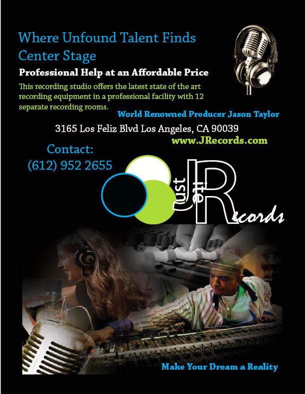
I used the same record company I created for the Music CD cover for my business flyer. The company’s name is "Just Rite Records." I tried to give the flyer a youthful flair because more often than not, my record label works with young and upcoming artists. At the bottom of the flyer I blended four images together, making sure to incorporate a diverse mixture of people and artistic abilities. Hopefully this expresses our desire to work with any artist that is passionate about his/her endeavors. The backdrop for the flyer is black to make the color scheme and photo overlay jump out at the viewer. The colors, which I took from the Just Rite Records logo give the overall design a cohesive yet artsy look. Traditionally text boxes are assembled in columns or are right aligned, but I chose to do otherwise. While still easy to read, the randomly assorted text boxes on the business flyer offer the creative and innovative approach we take to accomplishing each artist’s goals and dreams.