home | project 1 | project 2 | project 3 | photoshop
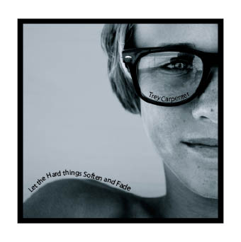
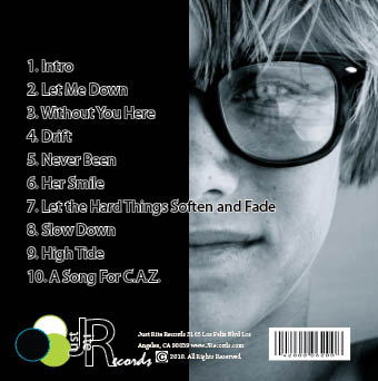
For this semester project, I decided it be best to make all three publications to be part of one organization and theme to give the pieces a cohesive look. For the CD cover, I went for a "John Mayer" vibe. While at first the front and back of the album do not look too complicated in design, there is more depth to the design then initially perceived. The photo on the front is one of my own that I took of my cousin. After much editing, I settled with a black and white color display with a light tint because visually it was more powerful than the photo with color. Adding more visual appeal, I split the photo in half as you can find the other half of his face on the backside of the album cover. On the font, I used the soft curves of his shoulder and glasses to my advantage when finding a place for the album title and artist name. I thought the empty space to the left of his figure really helped to exemplify his facial features while creating this softness to offer a nice contrast. On the back, his face is paired with a black background in order to give his track titles an extra "pop" and offer once again that contrasting element between his luring facial features and the look of the sleek black. This contrasting ideology stems from the Album’s title: "Let the Hard Things Soften and Fade" which also depicts this distinguished relationship.